The Big Picture
Shoot in-focus images where the back of the camera is parallel to the surface we are photographing in as even (think “overcast”) lighting conditions as we can manage. Bring the image into photoshop or similar software and try to lighten/darken (“dodge”/”burn”) parts to make the image evenly bright. We can remove obvious divots/specks that will be noticeable if repeated. Make it a seamless square-shape if necessary.
This is our ‘albedo’ map, the color information our our 3D model. We also want a normal map. We will use image->texture map software to create a normal map, fiddling with settings until it looks good.
Capture
Lighting
You want as diffuse lighting as possible. The goal is to use the image as a color map, which will then have shadows rendered in the 3D engine. So the goal is to get our captured image to have the color data as if the room had no lighting information, which means light that is soft and from many directions. One giant even light source, like a cloudy day.
That can be challenging indoors. We have a small amount of wiggle room when capturing materials that will be used in similar digital lighting conditions to the real lighting conditions they were captured in. Some of the shadows will be “baked” into the texture, but we may be able to work with it under some conditions.
Camera
Unless you know enough to do otherwise (shoot “raw” images), we want to capture high quality jpeg images. This should be the default setting of the camera, but it doesn’t hurt to double check. On Canon DSLR’s, under one of the first red “Camera” menu pages, you want Image Quality to be set to the L with the smooth curve next to it.

Shooting Settings
If you are using a DSLR, set the mode dial (the one with P/A/S/M or P/Av/Tv/M options) to “P”. This is a general automatic mode for cameras that allows you to use a feature called “Exposure Compensation” to make the image brighter or darker. Take a photo, if it’s too dark, either spin the large back dial (Canon 70D) or look for an icon that looks like a square made of two triangles, one white, one black, with +/- icons in it. That’s the exposure compensation icon. Hold it and spin the cameras main dial until the photo you take isn’t too dark or too bright.
Remember to set it back to “0” afterwards.
This sounds complex when written out in words, but just give it a go on a camera.
Level
If your texture is of something with noticeable lines, particularly vertical/horizontal ones (ie: brick), then it will make our life easier later to photograph it as level as possible. Use the guide-lines in the cameras viewfinder to align things.
We can rotate (using the crop tool) in any image editing software like Photoshop.
Focus & Depth of Field
For the most part, our textures will be flat surfaces. This means that so long as we are in focus on that surface, we should have a deep enough depth of field to get everything in focus. If you don’t, you are probably too close to the surface and maybe should back up a bit.
Distortion
It’s really really important for us to fight 2 kinds of distortion.
Barrel Distortion
The first is lens or barrel distortion. We want straight lines to appear straight in the image, and not have a slight curve to them. On many cameras, we can’t do much about this while shooting.
So to fix it, we can use Lens Correction features built into image editing software. In Photoshop, it will be “Filter>Lens Correction…”. Photoshop has a database of camera lenses and should do a good job automatically correcting most images.)
That said, some lenses have distortion when they are zoomed out all of the way. If you are using, say, a 16-135mm lens, maybe don’t shoot all the way wide at 16mm, but zoom in a bit.
Perspective Distortion
The second distortion is important on any camera we shoot on, and that is perspective distortion.
The short version is make sure the pointing direction of the lens is perfectly perpendicular to a flat surface we are photographing. In other words, we want the back of the camera to be parallel with the texture.
Doing this will ensure that any parallel lines in the texture are parallel in the image. It also is important for “noisy” textures with no clear lines, like concrete or carpet. Even though there are not obvious lines, the apparent size of this texture/noise is noticeable. It will be more difficult to make seamless textures if the perceived size/frequency of the noise doesn’t match.
An extreme example, notice the difference between the following images.
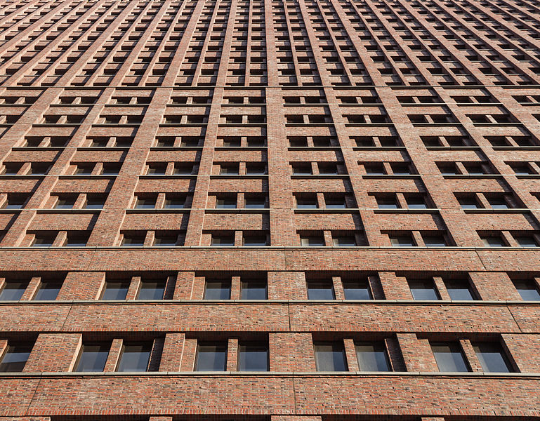
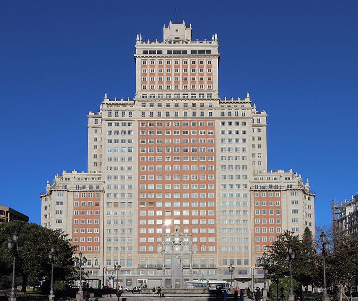
both images by Wikimedia Commons user Slaunger
Texture Map Creation
Get your .jpg image off of your camera and first into some archival photos folder. Copy the ones you want into a working folder.
Now make a copy of your image. Always keep an unedited original around, and every time you work on an image, work on a copy of it.
We will use Materializer. Download the software and extract the .zip to a folder. It does not need to be installed, the .exe will just run when we double click on it.
Click on the “O” in the “Diffuse Map” section, and open your diffuse map (your image).
Adjusting the Diffuse Map
There are some computational processes for making a diffuse map a bit better, you can play with some of the effects by selecting “Edit” in the Diffuse Map slot, and playing with sliders. Click “Set As Diffuse” if you are happy with the changes.
Making a Height Map
Now the “Create” under height map should be able to be selected. Click on that, and fiddle with the sliders until you get a greyscale image where the height of our texture corresponds to the tone/brightness of the image.
For a brick image, that means we want the crevices in between the bricks to be dark, and the bricks themselves to be bright. If some bricks are different colors than others, this can be a problem. The various sliders can give us a surprising amount of control over this (especially Frequency Contrast Equalizer).
Don’t underestimate these sliders and adjustments. The software may have a poor interface, but it’s underlying features are very powerful.
It also may mean we want to make a second version of our color image to generate the height map from, using Photoshop and some color filters/trickery to even things out. We can do whatever we want to get where we need to be.
Once we have something we think looks good, click “Set As Height Map”. We can go back to this later.
Making a Normal Map
Once we have a Height map set, we can click “Create” in the Normal Map slot. More sliders to adjust. The main ones being the Frequency Equalizer sliders.
To get a better sense of the preview, click the “Show Full Material” button. You can go back to editing any texture map by clicking it’s “Create”
Exporting the images
Click the “S” button in any slot to save the image. Or click “Save Project” to save a project file, which will also save the texture maps as .bmp files next to it.
In-Software Material Creation
In Unity, bring our images in. Select the Normal map asset, and look in the Import Settings, and change the Texture Type to “Normal Map”.
Create a new Material Asset. The standard shader should be fine. In the little square slot next to “Albedo”, drag and drop the color texture map image in.
Put the height map next to height map, and the normal map next to normal map.
The main settings to adjust here are the Smoothness and Metallic sliders.
Using Materializer Shaders
We can download shaders (new settings for a material) from the Materializer Website. You will download Unity_Shaders.unitypackage. In Unity, go to “Assets>Import Package>Custom Package…” and find the downloaded file.
Once you have done this, you don’t need to mess with the assets. Go to the material you have created, and at the top of it’s settings, there is a drop-down box that says “Shader”. Change the shader to one of the shaders in the Materializer sub-menu, which is now a thing you have. I think it’s standard shader is …fine. It has slots for texture maps to go, follow the same process as if you had used Unity’s general-purpose shader.